Company:
Vivint Solar
Year:
2019
Overview
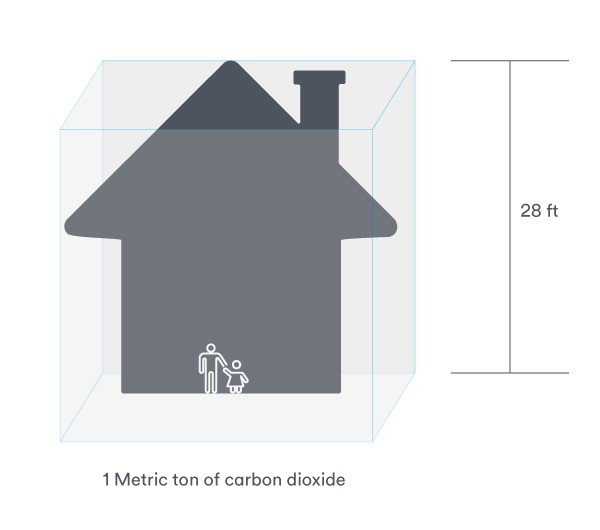
Vivint Solar needed two clear, visually engaging infographics to educate customers about carbon dioxide emissions and their environmental impact. I created a footprint-shaped graphic that compared state-by-state CO₂ emissions using scaled outlines of each state for clarity and visual interest. For the second infographic, explaining the volume of one metric ton of CO₂, I developed a clean, simple visual to make an abstract concept easy to grasp.
Problem
Customers often struggle to understand carbon emissions because the numbers are abstract, large, and difficult to visualize. Vivint Solar needed infographics that could simplify complex environmental data, making both state-by-state emissions and CO₂ volume relatable and easy to comprehend for a general audience.
Solution
I designed two distinct infographics tailored to the specific educational needs of each topic. The state emissions graphic used a footprint motif and accurate state scaling to create an engaging visual comparison, while the CO₂ volume graphic took a minimalist approach to break down a complicated measurement into a clear, accessible visual. Together, the designs made environmental data more digestible and reinforced Vivint Solar’s commitment to sustainability education.